Case study - 2024
My roles
UI Specialist, UX Designer
Category
Academic
Team
3 UX Designers
Duration
4 weeks
Overview
For this project, my team and I collaborated as part of the final assignment for our UI/UX Specialist Program. We worked with a real client, VanCastro, a driving school, to redesign their website and help them convert more students. To achieve this, we conducted two main research methods: competitor analysis and a user survey.
Competitor Analysis
Through our competitor analysis, we identified several key features present on competing websites that were missing on the client’s site.

Most competitors had a multi-page structure (unlike the client’s current single landing page), an online booking feature, and a blog. These features provided better navigation, increased engagement, and supported SEO performance.
User Survey
The client aimed to attract a diverse student base, extending beyond their primary Brazilian audience. With this in mind, we conducted a user survey to better understand individuals without a driver’s license, focusing on their preferences and needs regarding a driving school website. The survey received 21 responses, yielding the following key findings:

We also learned that users prioritized seeing clear pricing, educational resources, and instructors’ qualifications in that order.
Insights & Opportunities
Based on our research, we identified the following opportunities to improve the website:
Enhance SEO and visibility.
Improve user experience (UX).
Redesign the website structure to align with user needs.
SEO Improvements
What you see bellow is snaps of the current website and it works as a single landing page.

We introduced a multi-page structure and added a blog section to support keyword optimization and boost search engine rankings.

My Idea
I wanted to develop a feature that could help users overcome focus and productivity challenges—an issue I personally struggled with during my almost four years of remote work.
Struggling to stay on task often caused me a lot of anxiety, but when I tried productivity methods like the Pomodoro Technique, I noticed real improvement in my performance.
This experience inspired me to focus on creating a feature that would help remote workers better manage their tasks and boost their productivity.
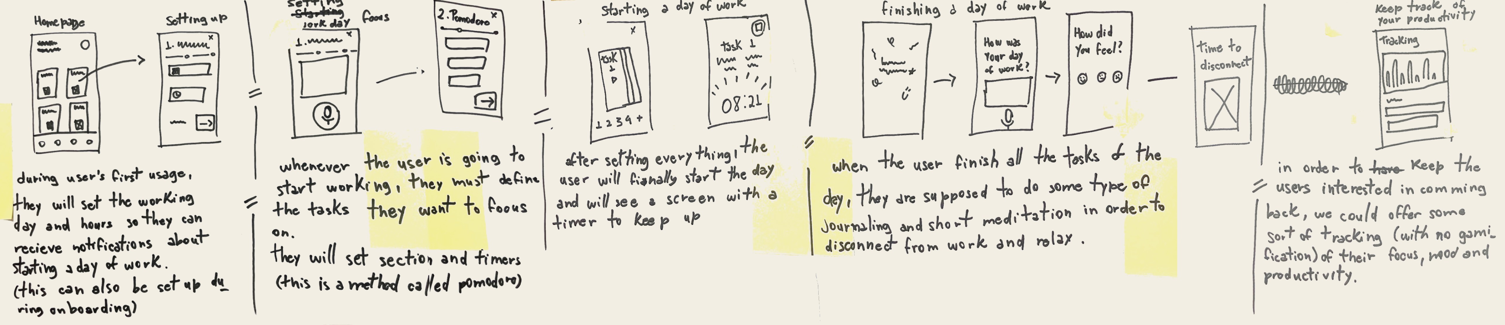
In this phase we followed the Sticky Decision process. This involved voting on the best ideas, giving feedback, voting again, and having a final discussion to narrow down our options. After this process, we landed on the final sketch.
Solution Sketch
The chosen solution was my own concept, and here’s what it looked like:
My Perspective
As I mentioned before, I wanted the main feature to focus on improving productivity and focus. But I also included elements to address other challenges we discovered in our desk research.
For example, after users finish their tasks, they go through a quick process to help them unplug from work, which tackles the issue that 22% of remote workers face—struggling to disconnect at the end of the day.
I also thought about adding mood tracking, to allow users to better understand their behaviors and feel motivated to improve performance.
Storyboard
Now that we have the final solution defined, my teammates and I each created storyboards and after the Decider reviewed them, we chose to move forward with Jou-An’s storyboard.
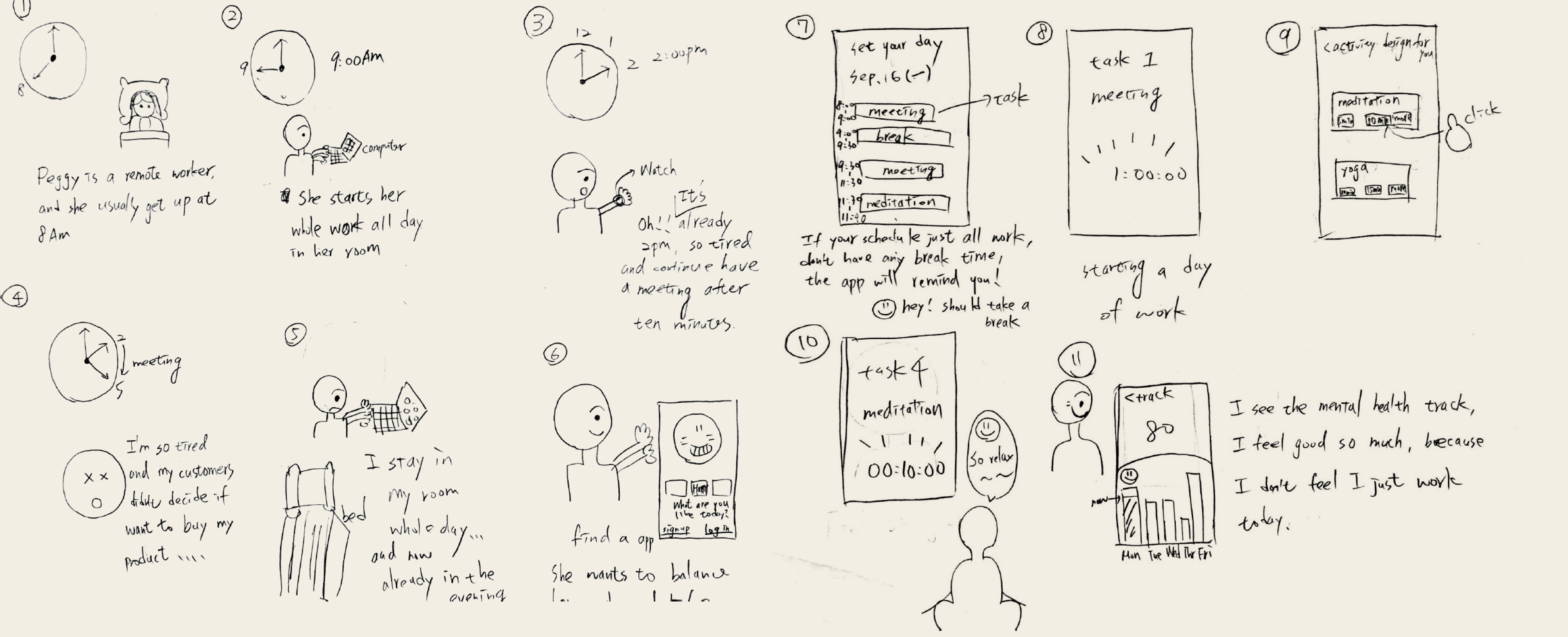
Based on my final sketch and Jou-An’s storyboard, we finally defined our solution:
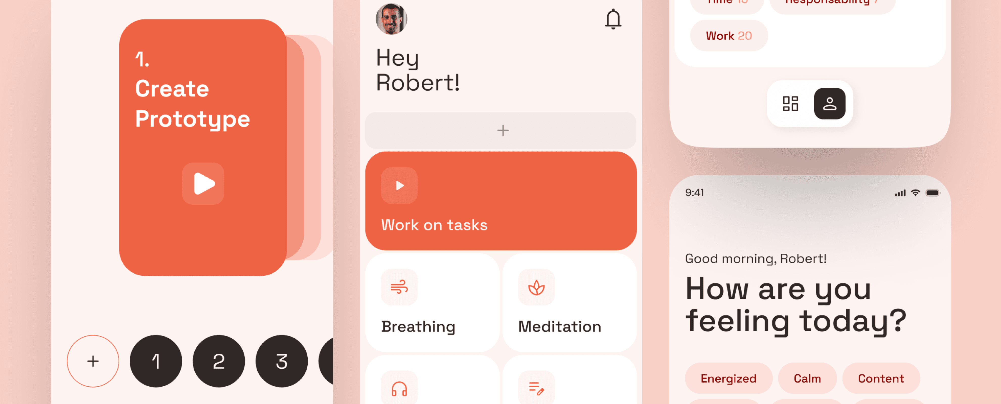
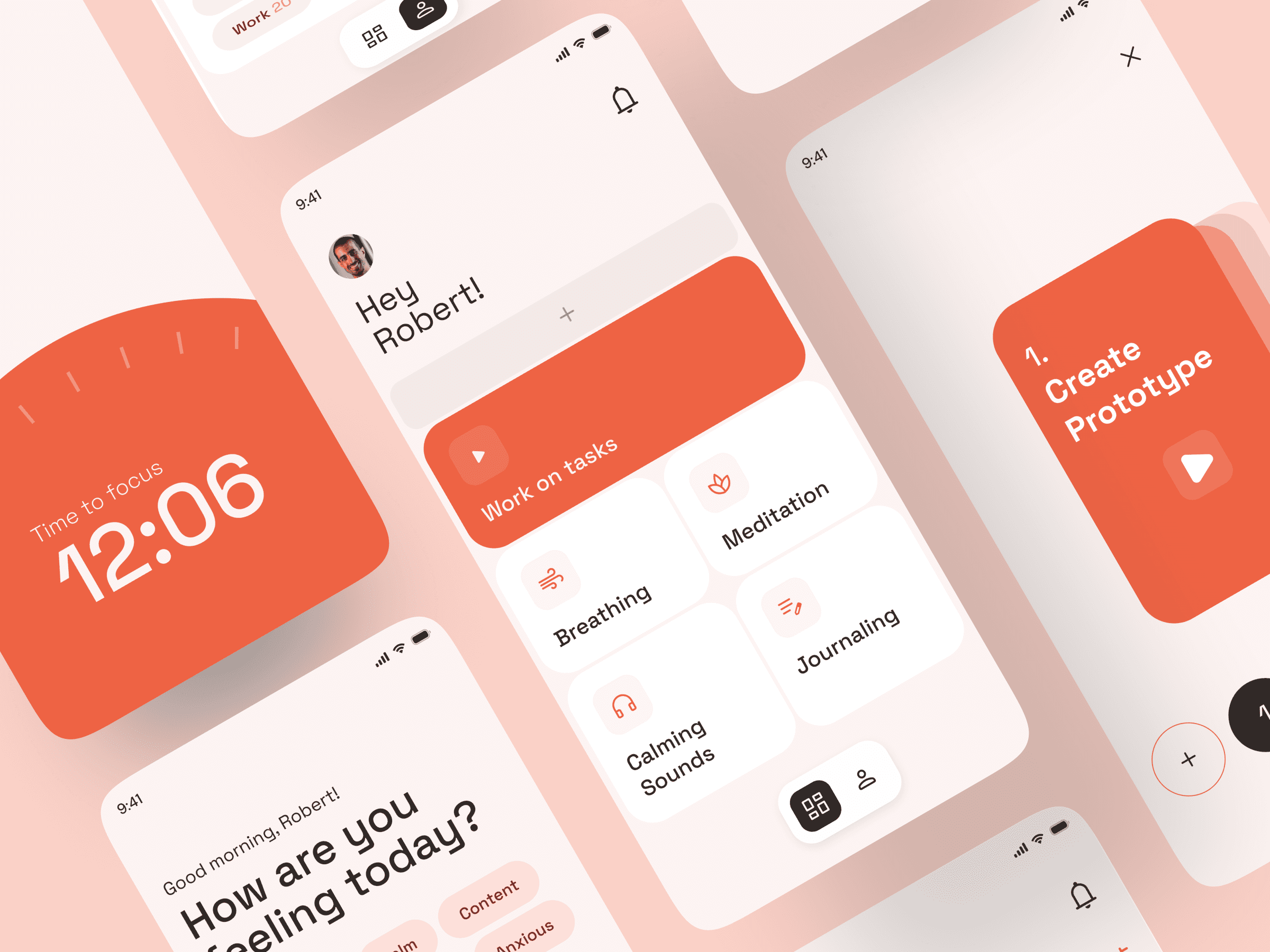
Solution
Design an app that helps remote workers integrate mindfulness into their daily routines by supporting focus on tasks, tracking mood progression, and providing tools to unplug from work at the end of the day.
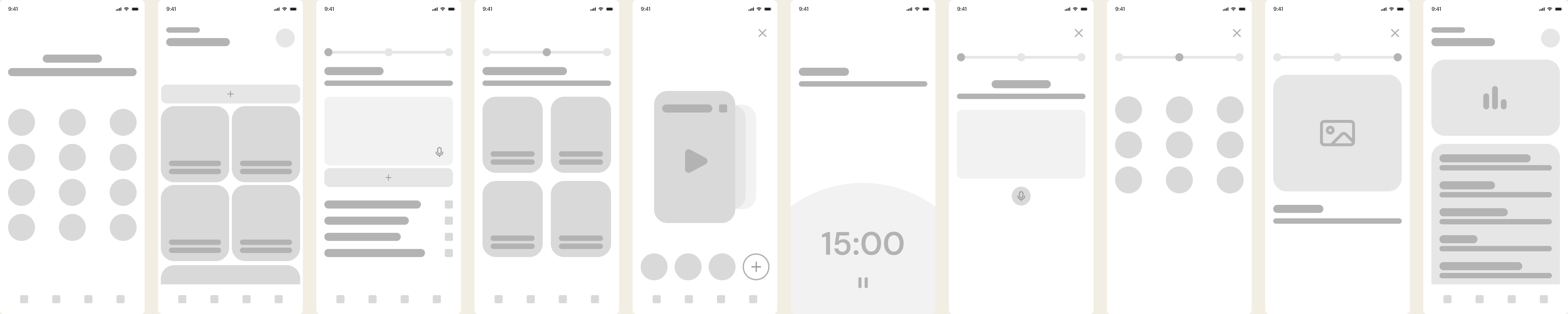
In this phase, we divided responsibilities among the team, and my task was to create the wireframes, hi-fi mockups and prototype.
Wireframe
My priority was to ensure that the app felt simple and easy to use, minimizing any potential stress users might already be experiencing from work. This approach led me to design a clean and straightforward user interface to keep things intuitive.
Challenges
One of the challenges I faced during the design phase was selecting the right color palette. I wanted to use calming colors, but I was mindful that low-saturation tones could sometimes feel dull or even sad.
After discussing it with my teammates, we chose orange as the primary color to convey a sense of energy and warmth while still maintaining a balanced and motivating vibe.
For the test phase, we followed both the Guerrilla Usability Test and the System Usability Scale (SUS) survey to gather user feedback.
Guerrilla Key Findings
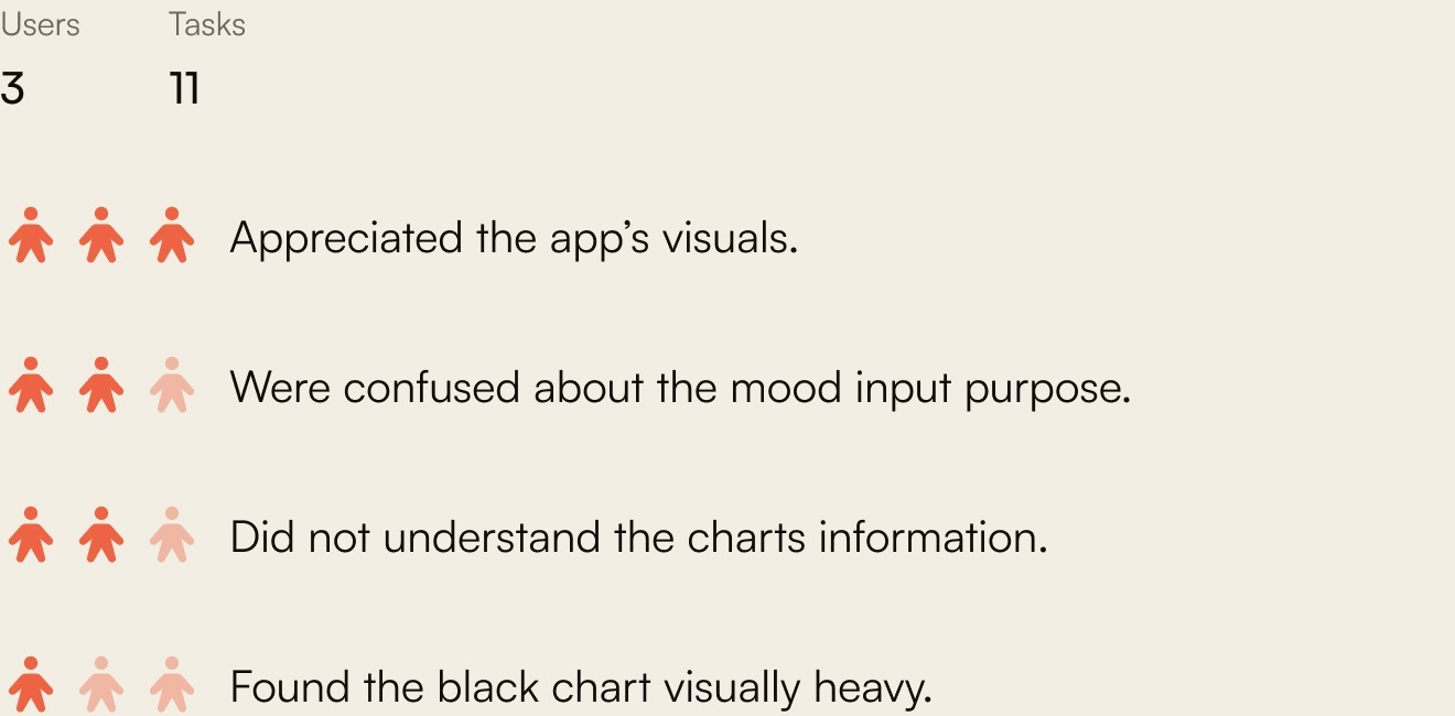
We also got a few interesting comments from users:
User 1
“I wouldn’t follow the ‘disconnect from work’ steps to finish the tasks because I’m lazy.”
User 2
“I’m not sure if I would keep using the app after a few days.”
User 3
“I wouldn’t do the journaling because I don’t want to think about work after I finish with it.”
SUS Results
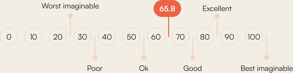
Feedback showed that the app’s design aesthetics were well-received, but improvements were needed to clarify certain features and refine data visualizations.
Future Improvement Ideas
Based on user feedback, we’re planning a few refinements to improve the experience further. We’d like to streamline the mood tracking flow to feel more natural, redesign data visualization with clearer charts and accessible colors, and make the “disconnect from work” feature more adaptable to fit different user needs. These updates would help keep users more engaged and address some of the challenges uncovered in testing.
Final Thoughts
The feedback gathered during the testing phase confirmed that the app’s core features were well-received, particularly in terms of design aesthetics. However, it also highlighted areas for improvement, such as clarifying certain functionalities and refining the data visualization.
For the Future
Hopefully, we'll be able to address the issues identified during user testing while refining and expanding the app's features. Our goal is to create a more intuitive and engaging experience that not only meets the needs of remote workers but also encourages consistent use.